:format(webp)/cdn.vox-cdn.com/uploads/chorus_image/image/32949333/Screenshot_2014-05-12_18.32.08.0.png)
"Correlation doesn't equal causation." You've heard it in statistics class, as a caveat in a million blog posts writing up data or a study (including some of mine), as a critique of those studies, and, naturally, as the premise for an XKCD cartoon. But I've rarely seen the point made as vividly as it was by Tyler Vigen, a law student at Harvard who, in his spare time, put together a website that finds very, very high correlations between things that are absolutely not related, like margarine consumption and the divorce rate in Maine:
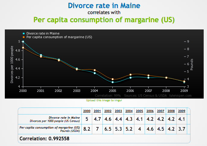
Courtesy of Tyler Vigen
Or whole milk consumption and the marriage rate in Mississippi:
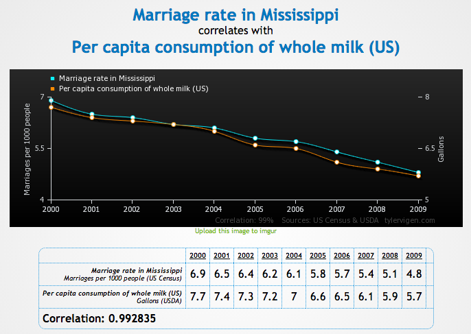
Courtesy of Tyler Vigen
Or the amount of money spent on pets in the US and the number of lawyers in California:
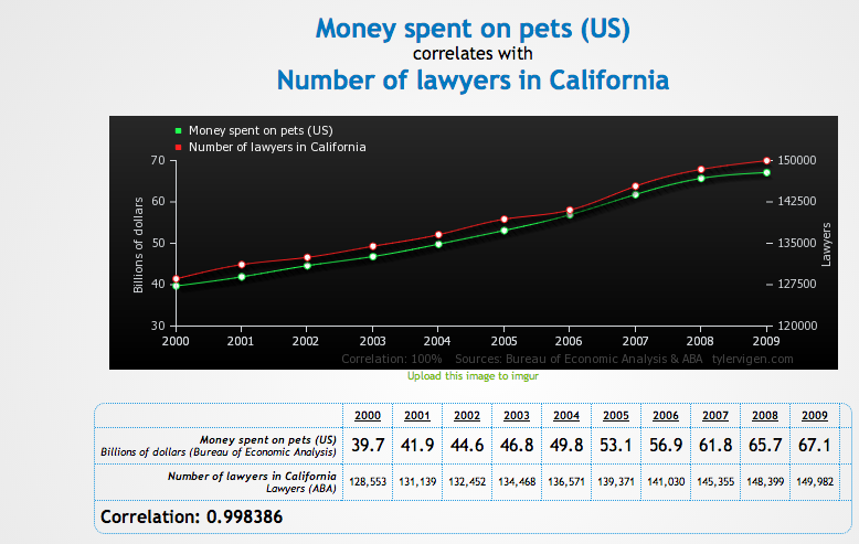
Courtesy of Tyler Vigen
Those all have correlation coefficients in excess of 0.99! That is very very high! By comparison, Alan Abramowitz's extremely accurate "Time for Change" model of presidential elections (it predicted Obama would get 52.2 percent of the two-party vote; he got 51.4) has a correlation coefficient of 0.97, which Abramowitz correctly calls "extraordinary." The point is that a strong correlation isn't nearly enough to make strong conclusions about how two phenomena are related to each other. Abramowitz's model is worth trusting not just because of its high correlation but because it predicts presidential elections based on factors that logically should matter to voters, like the state of the economy and what party currently controls the White House. That gives it theoretical plausibility, which a theory in which, say, US whole milk consumption is driven by the marital status of Mississippians, lacks.
Vigen tells me he got most of the data from the Centers for Disease Control and Prevention and the Census. "The death rates, precipitation data, and sunlight data were exported from the CDC," he says. "I wrote a script to cull through the exported data and make it usable by my program. For the bulk of the rest of the data, I manually copied it from US Census spreadsheets directly into an master spreadsheet. I only did about 100 variables the second way, so a lot of the correlations are between the interesting variables I copied and the less interesting (but sometimes humorous) ones from the CDC."
Viger says he might add more data in the future, but he's sure producing some striking nonsense correlations with what's in there now. The number of "suicides by hanging, strangulation and suffocation" seems to track the size of the legal profession quite well, both nationally:
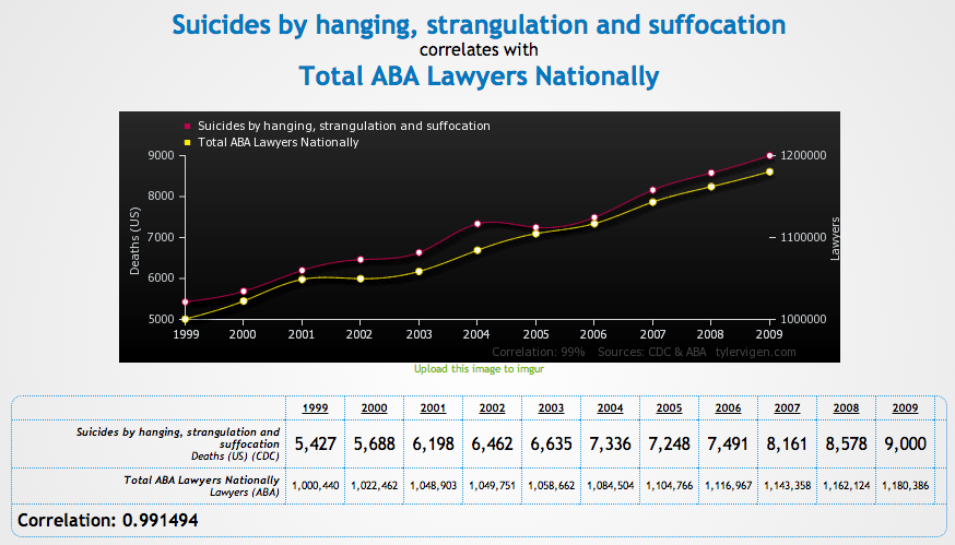
Courtesy of Tyler Vigen
And in North Carolina:
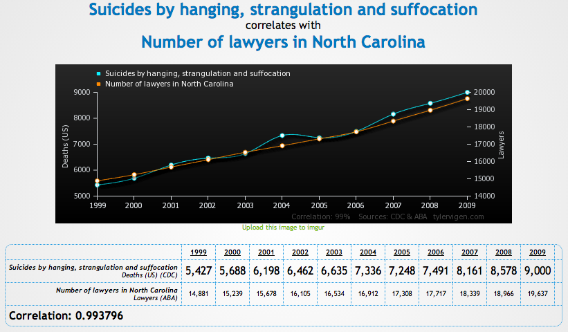
Courtesy of Tyler Vigen
And "deaths by getting tangled in one's bedsheets" jibes very well with trends in ski company revenue:
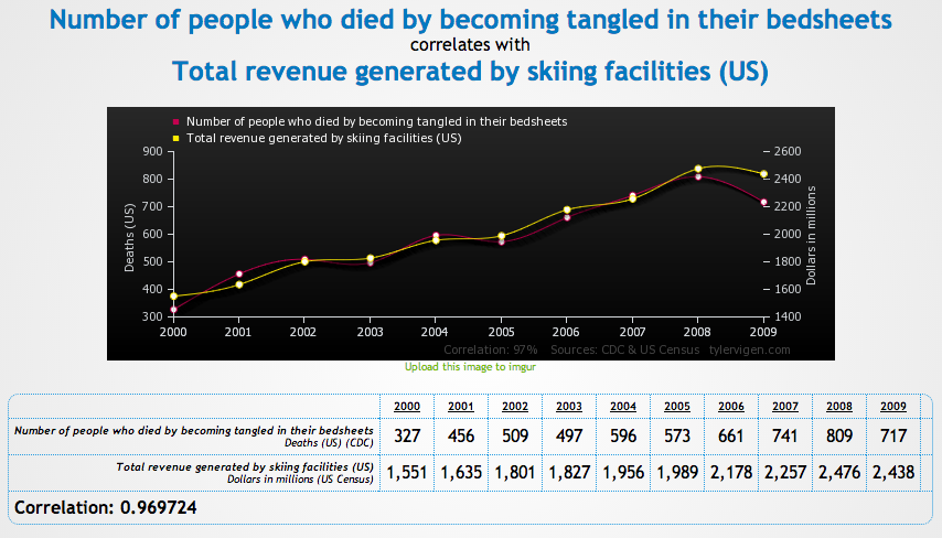
Courtesy of Tyler Vigen
Hat-tip Business Insider.