LURID: vivid in shocking detail; sensational, horrible in savagery or violence, or, a twice-monthly guide to the merits of the kind of Bad Books you never want your co-workers to know you're reading.
Do you remember the first time?
Do you remember youth, innocence, a burgeoning curiosity about Forbidden Things? Do you remember that initial casual-seeming encounter, at the drugstore, the supermarket, or perhaps the library? The lust at first sight? The overwhelming urge to fondle, to ruffle, to plunge in and discover if the inside was as titillating as the outside – just as soon as you were sure your Mom wasn’t looking? Do you remember the siren song of your first Bad Book? Do you remember how the cover sucked you in?
Was it primarily black, red and white? Did the tagline contain two or more ellipses… the words “untold”… “terrifying”…”deadly”… “shocker”? Was there a gleaming skull or putrefying hand? A flayed limb with a mouth where there should be none? A silhouetted spider? A single, staring eyeball? A sharpened blade? A puddle of blood? A broken doll? A clown with razor blades for teeth? A backlit mansion? Naked breastage? All of the above?
Was the primary image so haunting that it terrified you even after you’d left the store and closed your eyes? Were you obsessed for weeks by getting That Book, owning it in your secret place so you could find out if the story was as scary as the cover implied? Did you eventually sell your baby sister to a passing tinker to raise the requisite funds? Once obtained, did you devour it in one sitting? Did you feel nasty? Were you secretly relieved that the Thing on the cover never quite manifested within the pages? Nonetheless, did you boast about having read That Book the next day at school?
If you can remember, if you can still taste the way your mouth went dry when you saw That Book, you don’t need me to tell you that horror cover designs often promise more than the text delivers. Genre cover art isn’t there to represent the contents of the book. Instead, it triggers our imaginations into conjuring up so much more in the way of nebulous, gut-wrenching terror than can ever be pinned on the page. The best horror covers don’t intrigue or invite. They repel. They send anyone in their right mind screaming for help. Which, of course, leaves true horror fans eager to open up That Book and get down and dirty with the contents.
Modern mass market horror paperbacks can trace their origins to pulp comics and magazines of the early twentieth century and back through the dime novels and penny dreadfuls of the Victorian era. There’s always been a strong visual element to these publications as they were aimed at the less-literate and adolescents. In a crowded marketplace, the top sellers relied on a simple, ideally one-word, title and a disturbing cover image that hinted at even more depravity inside. The same principles used by designers of pre-Comics Code Tales From The Crypt covers were still in use during the zenith of horror paperback publishing in the 1980s and inform the glorious gory work of the likes of the Deadite Press today. Genre aficionados know that there’s usually a gap between the cover image and the contents and calibrate expectations accordingly. Yet, the best horror covers transcend the constraints of the form. They deliver more than a quick thrill. They tell a story within a single image. They juxtapose elements that are plain wrong together. They display a wicked sense of humor and a postmodern mastery of cliché. They make you stop, look and ponder the implications. They make you reach for your wallet. And, long after readers have forgotten the title, the author’s name, even the gist of the story, they remember the cover.
It’s impossible to pick just ten horror covers from the thousands of extant works of art. Given how classic horror is constantly being repackaged and republished, it would be easy to do a Top Ten of Lovecraft or Poe covers down the decades. I’ve already extolled the genius of the Jaws cover elsewhere, otherwise that would definitely be on here. Think of this list as a celebration of the different available flavors. While the artwork must signal genre at first glance, there are many techniques for trapping the reader in the tractor beam. The best artists – who often go uncredited – can be stylistic worlds apart, but they all share a macabre gift for grabbing our attention and lubricating our appetite for the story within.
 1. Tales From The Crypt #28
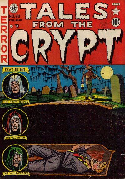
From the end of the Second World War till the enforcement of the Draconian Comics Code in September 1954, EC Comics cornered the market for bloodthirsty readers. Together with sister titles The Haunt of Fear and The Vault of Horror, Tales From The Crypt served up an entirely unhealthy feast of fun for horror fans – and some delightful cover art in the process. Lurid tales featured junkies, fallen women and low-life criminals alongside zombies, werewolves, vampires, aliens, and nameless things emerging from the sewers. This cover, from Feb/March 1952, drawn by Al Feldstein, is remarkably simple and sober for EC. The central third of the image is near-nothingness – it’s a bold move to have that much dead space on your cover. Nonetheless, that solid, dead space perfectly conveys why the man in the coffin’s eyes are bulging from his head in terror. This one will stay with you long after you’ve done your time as a juvenile delinquent.
[amazon 0312170408 inline]
 2. The Pan Book Of Horror Stories

First published in 1959, and then annually for the next thirty years, the Pan Book of Horror anthologized short stories, thus giving the cover artist free reign to conceptualize horror thematically, rather than tying him or her to specific content. Most of the covers are based on the human head, in various stages of decomposition and/or decapitation, and they can be beheld in all their glory here. Although a special mention has to go to The Eleventh… (two skeleton figurines watch a knife cutting into a blood-oozing wedding cake) and The Eighteenth (virtuoso deployment of the skull/spider/eyeball paradigms), my personal favorite has to be the malevolent confusion of The Twentieth, a pre-Photoshop mélange of a skull and an eyeball that starts out looking so wrong but makes more and more sense the longer you stare. Are those human teeth in the bottom jaw? Could they belong to Ed Gein or Jeffrey Dahmer? This image will float from your subconscious into a dream when you least expect it.
[amazon 0330027611 inline]
 3. Ancient Sorceries And Other Stories by Algernon Blackwood
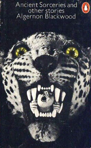
It’s the low rent aspect of this Penguin cover that’s particularly disturbing. That’s not a real leopard mask. You can see the grain of the fabric. It was once a plush toy, but the artist (uncredited, possibly Alan Aldridge, ‘The Man With Kaleidoscope Eyes’ who went on to do artwork for The Beatles) added the eyes and the terrifying detail of the poor soul caged by the teeth. This image manages to connote primitive rites, the Dark Continent, and tortured innocence in one fell swoop, whilst managing to imply that said rites are being carried out in the kind of dusty, shadowy attic where threadbare, unloved toys go to die. It sets the perfect tone for Blackwood’s old school horror.
[amazon 142093368X inline]
 4. Twice Blessed by Patricia Wallace
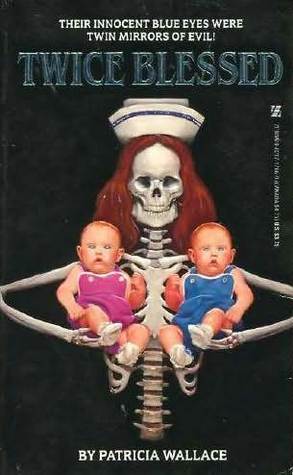
There are whole websites out there dedicated to the cover art of mass-market horror of the 1970s and 1980s. You can lose yourself for hours in the archives of Too Much Horror Fiction or Vault of Evil. Cover art of this era has a distinctive feel to it, fast and gross, often with the same medical-issue skeleton posed suggestively alongside whatever props could be dredged from the depths of the art department's dressing up box. The best examples are slightly surreal and don’t have much to do with the narrative material, instead referencing other works in the genre (The Exorcist and The Omen inspired a lot of copycats in the mid-1970s). They also display a sick sense of humor at work, as in this classic Zebra cover. I’ve never read Patricia Wallace’s book, Twice Blessed. There’s no need. This ruthlessly symmetrical nanny-skeleton, clutching demonic twins, says it all. Whatever’s inside could never be as good as the possibilities in my head.
[amazon 0821717669 inline]
 5. Slugs by Shaun Hutson
I’ve probably said more than is enough (especially for the faint-hearted) about Hutson’s schlocky Slugs. Nonetheless, this trash classic inspired not just one, but two memorable covers. The original artwork by Graham Potts works a bloodshot eyeball to the max. It clearly belongs to a woman, but is she high? Frightened? Insane? All three? And what’s that bulging slug doing? Reading her mind? Preparing to chow down? Flirting? All three? Kudos also goes to the slime trails that make up the title, and the tag line. How could you resist? The 1987 Leisure Books cover is deliciously over the top, lacking the enigma of Potts’ suggestive image. It pulls no punches: “This Bad Book is about slugs eating people’s brains”. Yet there’s a certain sexual ecstasy implied by the backwards angle of the guy’s head. Is he screaming in agony or making an ‘O’ face? Those writhing, tumescent slugs are intertwined around his skull in an almost affectionate manner. Is being eaten alive by slugs an orgasmic experience? Noooooooooooo!!
[amazon 0751518816 inline]
 6. The Book of Blood by Clive Barker
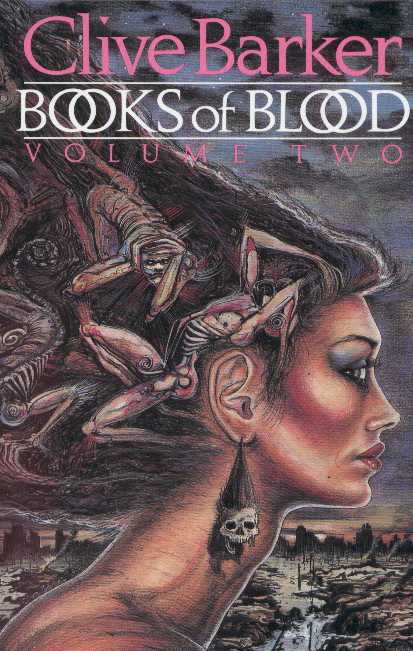
Clive Barker provided his own illustrations for the covers of his short story collections, The Book of Blood Volumes 1-6. This is a rare privilege for an author as jacket design is often the publisher’s choice, but it means there's a seamless match between the moods of the interior and exterior. Barker’s drawings are intricate and suggestive, tonally in keeping with his salacious aesthetic and all the more eerie for their pastel greys and purples. There’s nothing immediately garish about them until you take a closer look. The woman on the front of Volume Two gazes off into the ravaged landscape, clearly thinking about some disturbing stuff. Then you notice her gaudy makeup and shrunken head earrings. This chick was apocalypse-ready, and probably played a major part in bringing Doomsday on. Be very afraid of her.
[amazon 0425165582 inline]
 7. The Pilo Family Circus by Will Elliott
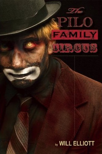
Horror fiction doesn’t have to be pulpy to scare the pants off the bookstore browser. Aussie novelist Will Elliott’s circus tour de force got a lot of love from Katharine Dunn (author of Geek Love) and garnered fistfuls of literary awards. It also got this unforgettable cover from Heidi Whitcomb. Traditionally garbed clowns have been so over-used as symbols of horror that they’re almost not scary any more. However, this clown is different. He’s handsome, in a Bundy way. He has a glowing yellow eye. He’s looking straight at you from the shelf. If you don’t pay the nice lady at the counter all your money and buy this book right now, he’ll come knocking. And when he’s outside your front door, he won’t be smiling any more. If ever a cover was a threat, rather than an invitation, this is it.
[amazon 0980226023 inline]
 8. Decay Inevitable by Conrad Williams
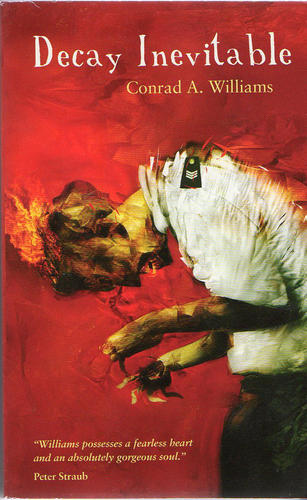
Dave McKean is renowned as a comic-book artist, for his CD and poster art, and for his collaborations with Neil Gaiman. If McKean’s illustrations for Coraline weren’t enough to give you nightmares for weeks, he’s also produced eyeball-searing book covers for everyone from Stephen King to lesser-known UK authors, like Williams. The design for Decay Inevitable gets its hooks into your brain and lays eggs there. There’s something intrinsically tragic and poetic about the image of a failed policeman: His brain is on fire. You must buy this book otherwise this poor man will continue to suffer excruciating pain. Are you really going to walk away?
[amazon 1844167496 inline]
 9. The Devouring (UK Edition) by Simon Holt
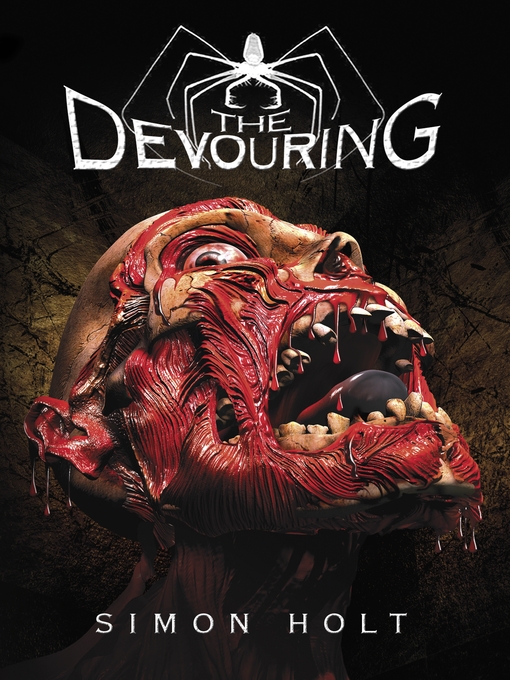
Ever wondered who’s tougher, British or American teenagers? If Attack The Block and the original version of Skins weren’t enough to convince you, then compare the UK and US versions of The Devouring, a YA horror novel about Vours, evil, soul-banishing entities that prey on children. The Brits get a startlingly graphic image of a human head that looks like it’s been plastinated mid-melt, complete with blackened tongue, jagged teeth and rolling eyeballs. To cap it off, there’s a dramatic spider – with outsize mandibles - atop the title. It could be the full color printing version of a Pan Book of Horror from the 1970s. It’s impossible to look away. In order to market the same book to US teenagers, the publishers used romantic purple smoke and a weeping teenage girl. Go figure.
[amazon 031602712X inline]
 10. Walking Wounded by Robert Deveraux
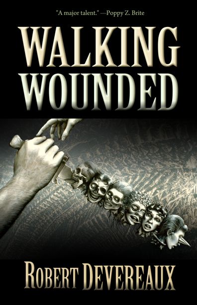
The joyous Deadite Press specialize in cult horror, as a quick browse of their catalogue (titles include Genital Grinder, Baby’s First Book of Seriously Fucked Up Shit, Mangled Meat, Bullet Through Your Face, Zombies and Shit among others) will attest. Carlton Mellick III has designed a wonderful set of lurid, full color covers for these tomes using Alan M. Clark's artwork, dripping in gore and full of all kinds of anatomical impossibilities. Take a look here, although I have no idea what’s going on in the Santa Claus Conquers The Homophobes picture other than it's NSFW. There’s a strange kind of understated beauty in the Walking Wounded cover, however, especially as it’s in restrained black and white. There’s severed, decomposing heads aplenty, but is that a woman’s hand reaching tenderly for the killer’s trophies at the top left? The tire tracks in the background add an uncomfortable touch of crime scene realism to the proceedings.
[amazon 1936383853 inline]
There you have it. What attracts or repulses you about a horror cover? What are some of your favorites?

About the author
Karina Wilson is a British writer based in Los Angeles. As a screenwriter and story consultant she tends to specialize in horror movies and romcoms (it's all genre, right?) but has also made her mark on countless, diverse feature films over the past decade, from indies to the A-list. She is currently polishing off her first novel, Exeme, and you can read more about that endeavor here .