Making Problems Visual

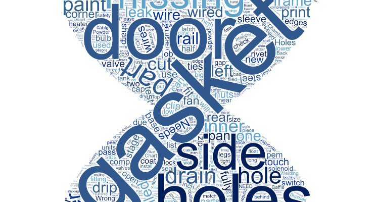
I was at a company recently that used the "word clouds" app to make problems visual. The more times a problem occurs, the larger the font gets in the picture. They use this to highlight the most frequent issues happening in the process. The picture is changed on a monthly basis to keep issues fresh in the technicians' minds. I walked by and it caught my eye. The app is free, thought I'd share. You may want to try it to invigorate problem-solving initiatives in your processes.
Continuous Improvement Manager at GBMP
7yBruce, The numbers behind the visual can be run through Pareto analysis. There are many word cloud apps out there, I haven't seen one yet that actually creates a Pareto chart.
President at GBMP
7yThis is an interesting concept. Would there be a font Pareto as well?