As a growing number of international NGOs are using infographics, charts and interactive maps to share success and highlight disaster, how can organisations with less resources create high quality visualisations without having to pay to outsource them?
We’ve put together a beginner’s guide for visualising development data.
Organising your data
The first thing you need to do is have a clear idea of the data you want to visualise. Are you trying to highlight a particular disparity between money spent in one place and another? Are you trying to show a volume of activity going on in one location?
Let’s imagine I’m running a campaign calling for better sanitation worldwide. To get my message across, I want to highlight how many countries still have poor access to clean toilets and and how little access has changed in over a decade since the MDGs were set. For the purpose of this tutorial, I’ll be using a dataset from the World Bank on access to improved sanitation facilities around the world.
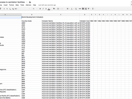
While I have data for over 10 years, I just want the figures for 2000 and 2012, so the first thing I need to do is remove any irrelevant columns and rows (tip: save a separate copy of the original first).
Before...
After...
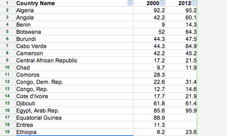
Once you’ve cleaned-up your data, you’re ready to visualise it. In this case before I visualised my data I also added a fourth column – the percentage difference between the 2000 and 2012 figures.
How to build a chart
Showing your data in a chart is the quickest and easiest way to visualise information. Datawrapper, Infogr.am and PiktoChart are all user friendly sites for building sleek, easy-to-customise charts that can be easily embedded on websites and are responsive to all screen sizes.
Datawrapper is perhaps the most intuitive and it’s free. A disadvantage of building charts though is that they’re not great at displaying large quantities of information, so I’m just going to display the most-improved 10 countries between 2000-2012. Here’s a quick walkthrough of how I made the chart:
- Create an account, then click on new chart.
- Copy and paste your data into the box.
- Check and describe your data - you can click on individual cells or columns to edit. Note how I added % to the numbers and rounded the numbers to 0 decimal places by editing a column.
- Now comes the fun bit - picking a chart template. I went with a simple column chart with interactive tabs, but there are a range of options to select from.
- The last step is to refine your chart. You can change the colours of the bars, add a title, a description, change the frame size of your chart and so on.
How to build a map
To highlight a large amount of data for different countries, using a map is a better option. Here’s a round-up of the best free tools for beginners.
Datawrapper
Datawrapper now offers a choropleth map option which allows you to differentiate between the highest and lowest value data by colour gradient. You’d build it the same way as a Datawrapper chart.
Pros: The quickest option. It will prompt you when country names don’t correspond with country shapes. When building a map, no matter what the software, you may have to go back to your spreadsheet a couple of times to tweak country names. For the map below, I had to change Democratic Republic of Congo to Congo - Kinshasa for it to show up. Another benefit of Datawrapper is that if you hover over different parts of the legend, only the countries in that colour will appear.
Cons: Map templates are not available for visualising cities or individual countries.
Google Fusion Tables
Pros: Completely free, and particularly easy for creating point maps.
This article includes content provided by Google. We ask for your permission before anything is loaded, as they may be using cookies and other technologies. To view this content, click 'Allow and continue'.
Cons: Not as intuitive as it first appears - for beginners, the choropleth map options are rather dated, although intermediate users who learned how to merge KML shapefiles with existing data tables, can create better maps. You cannot add map legends easily.
This article includes content provided by Google. We ask for your permission before anything is loaded, as they may be using cookies and other technologies. To view this content, click 'Allow and continue'.
CartoDB
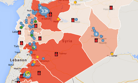
While CartoDB looks intimidating at first, it offers a number of the advanced customisable features that come with Tableau - definitely worth a look for intermediate mappers, or people who want to combine maps and charts onto one visualisation.
Pros: Easy to use and do basic-intermediate customisations; visualisations look sleek; can easily build country chloropleth maps or point maps for data with more specific locations; can add multiple layers. Works on mobile.
Cons: You have to pay if you’re anticipating using the tool to create more than 5 maps that will get more than 10,000 views a month. Layers appear on top of each other, rather than side by side. Maps are fantastic to view fullscreen, but I had to hide the legends and title box to best fit the frame size for this page.
This article includes content hosted on guardian-professional.cartodb.com. We ask for your permission before anything is loaded, as the provider may be using cookies and other technologies. To view this content, click 'Allow and continue'.
How to build a traditional infographic
Infographics are traditionally static, a colourful page layout bursting with icons and statistics. Info.gram and Piktochart are both tools worth exploring for this purpose. Both are simple to use, with drag-and-drop features and provide the option to copy and paste data to create charts. However, templates on both are limited with a free account.
Here is a quick example using the sanitation dataset.
This article includes content hosted on e.infogr.am. We ask for your permission before anything is loaded, as the provider may be using cookies and other technologies. To view this content, click 'Allow and continue'.
Further resources
- Mapping tutorials - Google Fusion tables (beginner/intermediate), CartoDB, Tableau.
- Data visualisation DIY: our top tools (Guardian Data Blog)
- Over 100 incredible infographic tools and resources
- How to … use maps to raise awareness
- Data visualisation for campaigners and activists (Guardian Masterclass)
This guide is not a comprehensive list of all the tools out there. In the comment threads below, do tell us below what experiences you’ve had doing data visualisations for development, and share your favourite tools and development infographics.
Join our community of development professionals and humanitarians. Follow @GuardianGDP on Twitter
Comments (…)
Sign in or create your Guardian account to join the discussion