
They say a picture is worth a thousand words. For Earth and space scientists, a certain class of images is worth much, much more.
These images are maps. They can slice across time and space, overlaying information on never-before-seen features or changing landscapes. They can even highlight how humans change those same landscapes. Maps are central to our sciences; without them, we’re just playing in the dirt.
This Earth Science Week, we took a look back at the many breathtaking maps highlighted in Eos and in American Geophysical Union blogs. These maps represent hundreds of hours of work by scientists and engineers. And many are fascinating works of art in their own right—we could spend hours poring over their fine details, patterns, and colors.
Here are 10 of our favorite such maps, in no particular order. Come marvel with us!
1. Gravity Waves

Is it an optical illusion? One of those magic eye pictures holding a secret message? Neither.
This map shows gravity waves. The waves form when the atmosphere is disturbed vertically and gravity tries to restore equilibrium, similar to ripples produced when you drop a rock in water. Gravity waves transfer energy and create turbulence.
Here we see gravity waves across the planet, mapped within the lower thermosphere at an altitude of 100 kilometers. In the map, the waves ripple outward, triggered by a tropical cyclone to the east of Australia. Scientists created the map in 2014 using a whole-atmosphere general circulation model that resolves gravity waves down to tens of kilometers, from Earth’s surface to the lower thermosphere.
2. Indian Ocean Seafloor
After Malaysia Airlines flight MH370 disappeared in March 2014, an unprecedentedly thorough deep-ocean search commenced. Survey teams used echo sounding techniques to scour the ocean floor for the missing airplane. Data collected in the search helped to create some of the most detailed maps ever of the southeastern Indian Ocean.
Here’s a fly-through of one such map, from a feature called Broken Ridge (the crack that cuts through this map) to the Diamantina Trench to cliffs beyond:

However, much of the world’s ocean floors remain poorly mapped. In some areas, knowledge of seafloor topography is worse than our knowledge of topography on Mars. Read an Eos opinion for intriguing maps of the extent to which the seafloor below your over-ocean flight has been coarsely mapped.
3. Gigapixel Gulf

This year, the U.S. Department of the Interior’s Bureau of Ocean Energy Management (BOEM) released the most highly detailed map of the Gulf of Mexico ever, and we can’t stop staring at it. Comparing prior maps to this new map shows smudges resolving into dunes, smears becoming faults, and shapeless lumps transforming into crystal-clear salt domes.
To create the rainbow landscape, project scientists combined more than 100 individual seafloor maps from 30 years of 3-D seismic surveys, many originally shot by 15 different companies involved in the oil and gas industry. Each pixel on this map is equal to the footprint of an American single-family house, and the map has 1.4 billion of them. And the lovely part? It’s freely downloadable!

With this new map, scientists can study how benthic communities have fared after the 2010 Deepwater Horizon oil spill or investigate the origins of the gulf’s salt deposits. The question now is, What do we name all these newly resolved features?
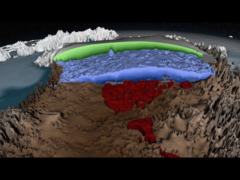
4. What’s Under (and in) the Ice?
Complex landscapes lie underneath glaciers, but envisioning them requires some sophisticated remote sensing. For example, scientists have used ice-penetrating radar to create a map of ancient river systems that once flowed under the Greenland Ice Sheet. The ancient watershed stretches to the size of the Ohio River Basin in the United States (more than 500,000 square kilometers). Researchers are also using a different technique—analysis of ice’s surface morphology—to estimate what features may be under Antarctic ice.
One ice-penetrating radar map captured our attention—in addition to showing features below Greenland ice, it shows classifications of the different ages of ice overlying it. See for yourself:
5. Mapping Vulnerable Permafrost

The permanently frozen soils of the Arctic hold 1,400 gigatons of carbon—about twice what is currently in the atmosphere. But that permafrost is melting. To better understand this potential, researchers released a map of regions around the Arctic that are particularly vulnerable to melting.
They created the map by combining satellite imagery from Google Earth with already existing data about the different soils and topography. The map highlights certain kinds of landscapes, such as areas with thermokarst lakes, that hold higher potential for methane emissions, telling them which areas could be the most impactful if melted.
6. Three-Dimensional Map of a Dome

Using 1.7 million seismic wave measurements from 227 earthquakes across East Asia, scientists created this 3-D image of the mysterious Hangai Dome in central Mongolia. Scientists have long debated the exact mechanism that formed the dome: Did tectonic forces uplift it? Or was it the product of magma upwelling?
The new map indicates that at some point in the dome’s past, warm rock rose up and melted magma. The heat from this magma likely buckled upper layers of rock, creating the feature’s dome shape.
7. Rainbow Hills

Did someone splash paint over this mountainscape, Jackson Pollock style? Sort of. This is a color-coded map of minerals likely scattered across mountains in Alaska’s Wrangell–St. Elias National Park and Preserve.
The scientists who created the map attempted to push the limits of hyperspectral imaging and measure wavelengths of light bouncing off minerals from a distance. Their goal? To simplify the search for resources like copper ore in Alaska’s remote peaks.
Copper is known to be associated with the presence of muscovite, a mineral that airborne hyperspectral images can readily detect. Although known locations of copper ore did correspond to the densest muscovite concentrations in the map, other minerals were found too. The result is a rainbow of signals from serpentine, muscovite, chlorite, calcite, gypsum, and more.
8. Volcano Bombs
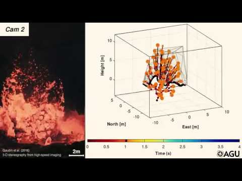
In this 3-D map, scientists wanted to understand how volcano bombs—those bits of rock and magma pumped out by an eruption—move through the air. The researchers were curious to know their speeds, which direction they fly, and how far they travel to better understand volcano hazards.
So they positioned a few high-speed cameras and tracked a few representative bombs, capturing what looks like streamers from fireworks or the threads of a Koosh ball.
9. Geologic Map of Mars

This colorful map shows the basins and volcanoes of one of our nearest planetary neighbors, Mars. It took 7 years of efforts to combine data from several Mars orbiters, which pull together high-resolution spatial data, mosaics of 100-meter-per-pixel infrared images, radar soundings of ice-rich rock, and data on the types of minerals that make up the rock.
This map has a scale of 1:20,000,000; digital versions give detailed context of individual features in time and space. Such context allows scientists to more precisely date craters and other formations on the Red Planet’s surface.
10. A Living Atlas
Want to watch land cover change over the past 15 years across the contiguous United States? Yeah, us too:

The video is a product of a new living atlas, which can stitch together the most recent images and data from satellites like the Moderate Resolution Imaging Spectroradiometer and Landsat to create real-time maps of the continental United States. Because the platform is based in the cloud, it can access vast computing power, allowing satellite swaths to be meshed together in a matter of hours. By contrast, a person piecing together the same map could take weeks to finish the task.
These kinds of maps will help scientists track urban development or offer real-time forecasts for agricultural sectors.
—JoAnna Wendel (@JoAnnaScience), Staff Writer; and Mohi Kumar (@scimohi), Scientific Content Editor
Citation:
Wendel, J.,Kumar, M. (2017), Ten mesmerizing geophysical maps that double as works of art, Eos, 98, https://doi.org/10.1029/2017EO084797. Published on 13 October 2017.
Text © 2017. The authors. CC BY-NC-ND 3.0
Except where otherwise noted, images are subject to copyright. Any reuse without express permission from the copyright owner is prohibited.