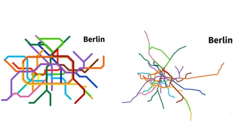
Public transit maps occupy a unique place in the mapping world, and must strike a careful balance between readability, detail and aesthetic design. To that end, they necessarily distort the city’s true geography and with it, our own mental conception of the city too.
But just how distorted are the world’s metro maps? A recent series of animated graphics, created by the DIY cartographers of the online forum Reddit, answers that question. Scroll down to see the metro maps of six global cities transform to match their true geography.
London
As is the case with most metro maps, London’s iconic Tube map exaggerates the size of the city centre, while shortening and simplifying the lines radiating out toward its periphery. The prominent region enclosed by the Circle Line (the bottle-shaped yellow loop in the centre) occupies about 6% of the Tube map’s total area. In reality, it is only about a quarter that size. London’s Square Mile (the neck of the bottle) is only about one-sixth as large as it appears on the map.
Berlin
Berlin’s public transit map, which looks strikingly similar to London’s, undergoes a similar transformation. The loop enclosing the city centre shrinks down to a fraction of its former size, while the routes leading to the Berlin’s outskirts morph from short, straight lines to elongated, curvy paths.
Paris
This article includes content hosted on s3.amazonaws.com. We ask for your permission before anything is loaded, as the provider may be using cookies and other technologies. To view this content, click 'Allow and continue'.
This map begins with a geometric variation of the Paris Metro map, rather than the standard map familiar to Parisians. As it transforms, the map resembles a multi-limbed creature giving its legs a good stretch, albeit not to the degree of its London and Berlin counterparts.
New York City
This article includes content hosted on s3.amazonaws.com. We ask for your permission before anything is loaded, as the provider may be using cookies and other technologies. To view this content, click 'Allow and continue'.
New York’s islands and rivers constrain the design of its subway map, allowing for only so much distortion while remaining consistent with the city’s geographic features. This means that compared with other transit maps, New York’s is largely true to reality. The most apparent difference is the “fattening-out” of Manhattan, without which the dense network of subway lines traversing its length would be almost unreadable.
Philadelphia
This article includes content hosted on s3.amazonaws.com. We ask for your permission before anything is loaded, as the provider may be using cookies and other technologies. To view this content, click 'Allow and continue'.
Philadelphia boasts a surprisingly diverse transit system that includes a mix of commuter rail, rapid transit and trolleys, all of which make stops both above and below ground as they pass through the city centre. The difference in scale between the commuter rail and other transit systems is not apparent on the official map, but becomes clear in the geographically accurate version.
Hong Kong
This article includes content hosted on s3.amazonaws.com. We ask for your permission before anything is loaded, as the provider may be using cookies and other technologies. To view this content, click 'Allow and continue'.
This map of Hong Kong’s Mass Transit Railway gives the clearest picture of how Hong Kong’s transit map distortions compare to the geography of the city with the shape of the islands in the background.
These maps are just seven examples from a much larger series posted on Reddit over the last few weeks, including: Sao Paulo, Barcelona, Washington DC, Montreal, Vienna, Guangzhou, Oslo, and many others.
You can find the rest of the collection by searching here. And if you’re up for a challenge, see if you can identify these world cities from their “naked” metro maps.
Follow Guardian Cities on Twitter and Facebook to join the discussion, and explore our archive here

Comments (…)
Sign in or create your Guardian account to join the discussion