The ‘map distance’ vs. the ‘geographic distance’ of the NYC subway
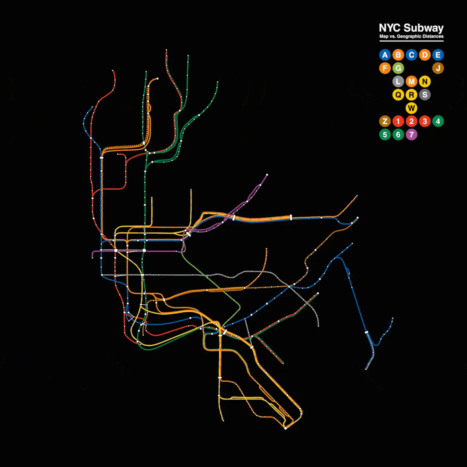
The NYC subway map tidily lays out over 665 miles of track and 472 stations into a simple, easy-to-read design. While the map gives the impression that our fair city’s transit system is orderly and evenly spaced, as any true straphanger will tell you, that’s not the reality. Indeed, those colorful lines and nodes have been placed for maximum legibility, simply showing geographical approximations that often don’t even kind of match up with real life (as this man will tell you). Now, one redditor brings us an entrancing new animation that removes the MTA’s distortion, giving us a look at the real distance that exists between stations and lines.
As seen above, the distance between each stop and line is actually a lot closer than what’s depicted in the MTA’s version of the map. The best example of this can be seen in the Financial District where the official map shows a neighborhood with stops comfortably spaced out. In actuality, the stations are tightly clustered together. The same goes for stations on the Lower East Side which contract significantly when adjusted for distance.
[Via Reddit]
RELATED:
